
Fairmont Hot Springs: Who’s who in business
Fairmont Hot Springs, B.C., is an unincorporated resort community located on Highway 93/95 in southwestern British Columbia’s Columbia River valley.
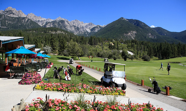
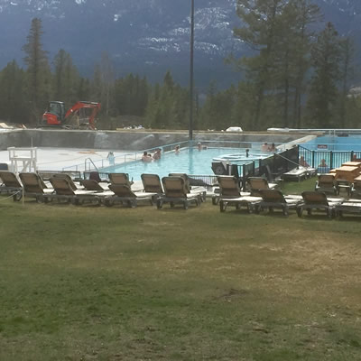
Fairmont Hot Springs is an all-season playground. — Photo courtesy Fairmont Hot Springs Resort
Fairmont Hot Springs, B.C., is an unincorporated resort community located on Highway 93/95 in southwestern British Columbia’s Columbia River valley.
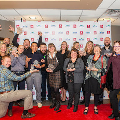
The 22nd Annual Columbia Valley Chamber of Commerce Business Excellence awards were held on November 18, 2021.
by Julie Matchett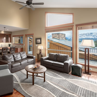
Fairmont Creek Vacation Rentals manages unique properties in the Columbia Valley
by Virginia Rasch
The Columbia Valley Chamber of Commerce handed out 12 awards at its annual Business Awards gala.
by Virginia Rasch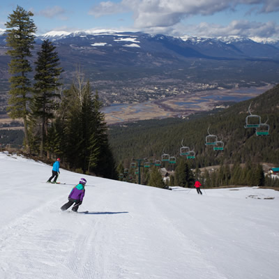
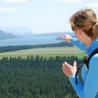
Family-friendly ski area in the heart of the B.C. Rockies improves facilities for the upcoming season

Sharma brings over 25 years of global hospitality management experience to the role
Most of the projects will be wrapped up before Fairmont's busy summer season arrives
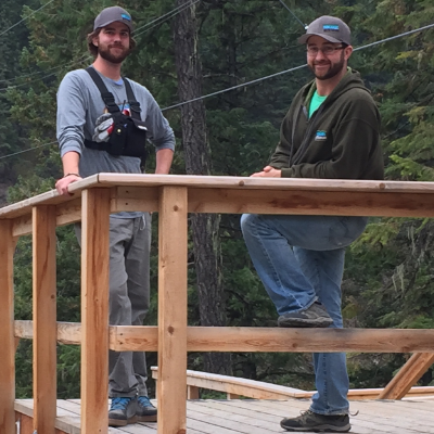
Todd and Jay Manton, owners of Kokanee Mountain Zipline in Nelson and Mineral Mountain Ziplines in Fairmont, are Top 10 Business People
by Kyle Born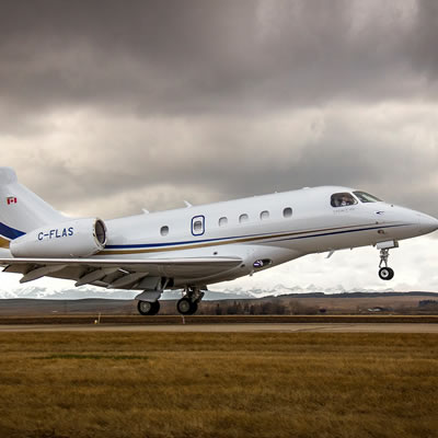
AirSprint offers programs designed for personal and business requirements.

The difference between inclusive marketing and effective financial planning

Why a good investment plan should outlast changing moods and seasons

Let the experts at Deans Plumbing and Heating in Cranbrook improve the comfort level of your home with an assessment of your HVAC system.

A.C. Dyck in Cranbrook can help you navigate the financial challenges of divorce with clarity and confidence.
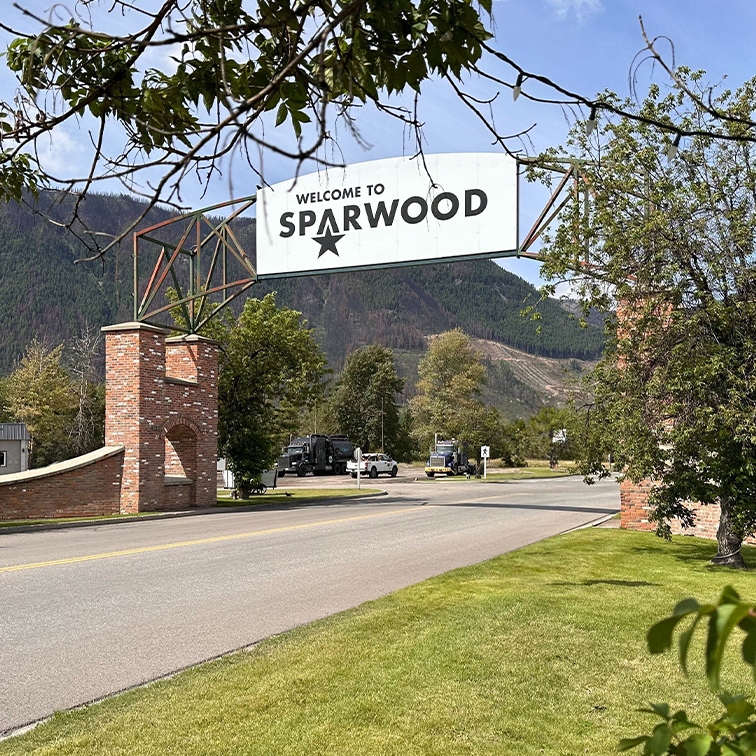
New Dawn Developments expands affordable, diverse housing in Sparwood and Cranbrook with Westwood and Southwood Heights
Why long-term investing is less about wealth or timing and more about structure, consistency and intentional financial decisions.